CSS ile Form Tasarımı
 Kullanıcı arayüzü ve deneyimi söz konusuyken, form öğelerinin dizilişi ve tasarımı büyük önem taşımakta. Özellikle uzun yapıdaki formlar kesinlikle tekrar elden geçirilmeli, gerekirse tasarımla basitleştirilmeli ve adımlara bölünmeli. Hazırlayacağımız örnek yapı sayesinde varolan bir form yapısının HTML kodlarına hiç dokunmadan yepyeni bir tasarım oluşturacağız.
Bu makalemizde sadece CSS kodlarıyla bir form öğesini tüm iç detaylarıyla şekillendireceğiz. Üzerinde oynayacağımız form yapıları şöyle : Form, legend, label, input, fieldset, select, textarea, checkbox.
Örneği görüntüleyerek başlayabilirsiniz.
CSS ile Form Tasarımı
Tasarımı detaydan genele etki edecek şekilde hazırlayacağız. İlk olarak form içerisinde kullanılan input, textarea, select, checkbox gibi öğeleri hazırlayalım.
Aşağıdaki görseli öğelerin hover versiyonları için kullanacağız.
Hover Background Görseli : 
Input Tasarımı
Tüm input yapılarımız için ayrıştırılmış CSS kodlarımızı yazalım.
input {
  -webkit-transition: border, 100ms;
  transition: border, 100ms;
  font-size: 1em;
  font-family: 'Open Sans', helvetica, sans-serif;
  line-height: 1.5em;
  -moz-box-sizing: border-box;
  -webkit-box-sizing: border-box;
  box-sizing: border-box;
  -moz-box-sizing: border-box;
  padding: .5em 1em;
  border: none;
  background: #e2e2e2;
  display: block;
  margin: .5em 0;
}
input:focus {
  border-left: 0.5em solid tomato;
}
input:focus {
  color: #333;
}
input:focus {
  -webkit-box-sizing: border-box;
  -moz-box-sizing: border-box;
  box-sizing: border-box;
  outline: none;
  background: url('images/bg-stripes.png');
}

input[type="email"],
input[type="password"] {
  width: 50%;
}

input[type="text"] {
  width: 100%;
}
Örnek HTML kodu :
<input type="email" placeholder="Email">
Textarea Tasarımı
Textarea için basit bir tasarım oluşturalım.

textarea {
  -webkit-transition: border, 100ms;
  transition: border, 100ms;
  font-size: 1em;
  font-family: 'Open Sans', helvetica, sans-serif;
  line-height: 1.5em;
  -moz-box-sizing: border-box;
  -webkit-box-sizing: border-box;
  box-sizing: border-box;
  -moz-box-sizing: border-box;
  padding: .5em 1em;
  border: none;
  background: #e2e2e2;
  display: block;
  width: 100%;
  min-width: 100%;
  max-width: 100%;
}
textarea:focus {
  border-left: 0.5em solid tomato;
}
textarea:focus {
  color: darkslategray;
}
textarea:focus {
  -webkit-box-sizing: border-box;
  -moz-box-sizing: border-box;
  box-sizing: border-box;
  outline: none;
  background: url('images/bg-stripes.png');
}
Örnek HTML kodu :
<textarea></textarea>
Select Tasarımı
Sırada dropdownlarımız için tasarım oluşturmak var.

.select {
  position: relative;
  width: 50%;
  -moz-box-sizing: border-box;
  -webkit-box-sizing: border-box;
  box-sizing: border-box;
  -moz-box-sizing: border-box;
  border: none;
  background: #e2e2e2;
}
.select:focus {
  -webkit-box-sizing: border-box;
  -moz-box-sizing: border-box;
  box-sizing: border-box;
  outline: none;
  background: #f3f3f3;
}
.select:after {
  -ms-transform: rotate(-45deg);
  -webkit-transform: rotate(-45deg);
  transform: rotate(-45deg);
  position: absolute;
  right: 1em;
  bottom: 40%;
  display: block;
  width: .75em;
  height: .75em;
  border: 2px solid darkslategray;
  border-top: none;
  border-right: none;
  content: '';

}
.select:focus, .select:hover:after {
  border: 4px solid tomato;
  border-top: none;
  border-right: none;
  -webkit-transition: border, 100ms;
  transition: border, 100ms;
}
.select select {
  -moz-appearance: none;
  -webkit-appearance: none;
  -webkit-transition: border, 100ms;
  transition: border, 100ms;
  font-size: 1em;
  font-family: 'Open Sans', helvetica, sans-serif;
  line-height: 1.5em;
  -moz-box-sizing: border-box;
  -webkit-box-sizing: border-box;
  box-sizing: border-box;
  -moz-box-sizing: border-box;
  padding: .5em 1em;
  border: none;
  background: #e2e2e2;
  background: transparent;
  z-index: 1;
  position: relative;
  display: block;
  width: 100%;
  outline: none;
  border: none;
  font-size: 100%;
}
.select select:focus {
  border-left: 0.5em solid tomato;
}
.select select:focus {
  color: darkslategray;
}
.select select:focus {
  -webkit-box-sizing: border-box;
  -moz-box-sizing: border-box;
  box-sizing: border-box;
  outline: none;
  background: #f3f3f3;
}
.select select:focus {
  background: url('images/bg-stripes.png');
}
.select select:focus + .select:after {
  border: 4px solid tomato;
  border-top: none;
  border-right: none;
  -webkit-transition: border, 100ms;
  transition: border, 100ms;
}
Örnek HTML kodu :
<select name="select-choice">
    <option value="Choice 1">Seçim 1</option>
    <option value="Choice 2">Seçim 2</option>
    <option value="Choice 3">Seçim 3</option>
</select>
Radio Buton ve Fieldset Tasarımı
Radio butonlarıyla birlikte fieldset öğelerimizi de tasarlayalım.
fieldset {
  margin: 1em 0;
  padding: 1em;
  border: #f3f3f3 solid 2px;
  border-radius: 0.3em;
  text-align: center;
}
fieldset.radio-list {
  text-align: left;
}
fieldset.radio-list input[type="radio"] + label {
  display: block;
}
fieldset input[type="radio"] {
  position: absolute;
  opacity: 0;
}
fieldset input[type="radio"] + label {
  margin-right: 1em;
  color: #999;
  cursor: pointer;
}
fieldset input[type="radio"]:focus + label,
fieldset input[type="radio"]:hover + label,
fieldset input[type="radio"] + label:hover,
fieldset input[type="radio"]:checked + label {
color: darkslategray;
}

fieldset input[type="radio"] + label span {
  display: inline-block;
  -webkit-box-sizing: border-box;
  box-sizing: border-box;
  -moz-box-sizing: border-box;
  margin-right: .25em;
  width: 1em;
  height: 1em;
  border: .25em solid #ccc;
  border-radius: 50%;
  vertical-align: text-bottom;
  -webkit-transition: border, 200ms;
  transition: border, 200ms;
}
fieldset input[type="radio"]:focus + label span,
fieldset input[type="radio"] + label:hover span,
fieldset input[type="radio"] + label span:hover {
  border: 0.25em solid darkslategray;
}
fieldset input[type="radio"]:checked + label span {
  border: 0.25em solid tomato;
  background-color: darkslategray;
}
Checkbox Tasarımı
Şimdi sırada checkbox tasarımlarını oluşturmak var.
input[type=checkbox] {
  margin: 0;
  width: 20px;
  height: 20px;
  opacity: 0;
}

.checkbox {
  position: relative;
  clear: both;
  margin: 1em 0;
  text-align: left;
}
.checkbox label {
  position: absolute;
  top: 0;
  left: 0;
  margin: 0;
  width: 20px;
  height: 20px;
  border-radius: 0.3em;
  background: #e2e2e2;
  cursor: pointer;
}
.checkbox label:after {
  filter: progid:DXImageTransform.Microsoft.Alpha(Opacity=0);
  opacity: 0;
  -ms-transform: rotate(-45deg);
  -webkit-transform: rotate(-45deg);
  transform: rotate(-45deg);
  position: absolute;
  bottom: .6em;
  left: 25%;
  width: 0;
  height: 0;
  border: 2px solid #333;
  border-top: none;
  border-right: none;
  background: transparent;
  content: '';
  -webkit-transition: width, height, border, 100ms;
  transition: width, height, border, 100ms;
}
.checkbox input[type=checkbox]:focus + label:after, .checkbox label:hover:after {
  filter: progid:DXImageTransform.Microsoft.Alpha(Opacity=50);
  opacity: 0.5;
  width: 1em;
  height: 8px;
}
.checkbox input[type=checkbox]:checked + label:after {
  filter: progid:DXImageTransform.Microsoft.Alpha(enabled=false);
  opacity: 1;
  width: 1em;
  height: .6em;
  border: 4px solid tomato;
  border-top: none;
  border-right: none;
}
.checkbox span {
  margin-left: 2em;
  line-height: 20px;
}
Örnek HTML kodu :
<div class="checkbox">
   <input type="checkbox" name="checkbox" id="checkbox" />
   <label for="checkbox">
        <span>Onaylıyorum</span>
   </label>
</div>
Submit Butonu Tasarımı
En son olarak submit butonunu form öğelerine uyduralım.

input[type="submit"] {
  -webkit-transition-property: background-color, color;
  transition-property: background-color, color;
  -webkit-transition-duration: 200ms;
  transition-duration: 200ms;
  display: block;
  margin: 0 auto;
  padding: .5em 2em;
  width: 50%;
  border: none;
  border-radius: 0.3em;
  background-color: grey;
  color: white;
  font-size: 1em;
}
input[type="submit"]:hover, input[type="submit"]:active, input[type="submit"]:focus {
  background-color: tomato;
  color: white;
}
Örnek HTML kodu :
<input type="submit" value="Gönder" />
Ek Tanımlar
Son olarak çevresel öğeleri de forma uydurabiliriz. Yazı tipleri, arkaplan renkleri, label’lar ve legend’lar gibi.
::-moz-focus-inner {
  border: 0;
}

*::-moz-selection {
  background-color: tomato;
  color:white
}

*::selection {
  background-color: tomato;
  color:white
}

body {
  background: #d7d7d7;
  color: darkslategray;
  font-family: 'Open Sans', helvetica, sans-serif;
}

form {
  margin: 4em auto;
  padding: 1em;
  max-width: 640px;
  background: white;
  border-radius: 0.25em;
}

legend {
  display: block;
  margin: 0 auto;
}

label {
  display: inline-block;
  margin: .5em 0;
}
Kapanış
Görüntülediğiniz form tasarımının orjinali Scott Smith tarafından hazırlandı. İlgili tasarıma buradan erişebilirsiniz. Biz tasarımı elden geçirip, SCSS diliyle hazırlanmış kısımlarını tekrar CSS’e çevirdik.
İyi çalışmalar.
 Google Material Design Menu
 CSS ile SEO ve performans dostu harika resim açıklamaları
 CSS ile Üzerine Gelince Büyüyen Resimler
 Görsellerinize Büyüteç ile Bakın
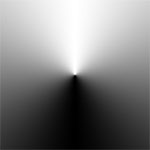 CSS Gradient Arkaplan ve Performans
 CSSGram ile Resimlerinize Instagram Filtresi Ekleyin
 CSS Background Nedir? Nasıl Kullanılır?
 CSS ile Yazı Ayıracı
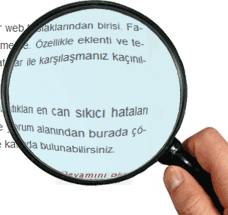 CSS3’ün Hyphens Özelliği ile Mükemmel Paragraflar Hazırlayın
 CSS ile Alıntılarınızı Şekillendirin
 Photoshop ile Arkaplan Temizleme (Dekupe) ve Fırça Yapımı
 Photoshop ile “This is it” Film Afişi Hazırlama
 Tüm Detaylarıyla SEO Plugin by SQUIRRLY
 Balsamiq nedir? Nasıl kullanılır?