CSS ile Etkileyici İnteraktif Logo
Merhaba arkadaşlar.
 Bu makalemizde CSS’in Blur efektini kullanarak tanım ve slogandan oluşan gayet etkileyici bir logo (başlık örneği de olabilir) hazırlayacağız. Öncesinde örneği görüntülemek isteyebilirsiniz.
Yazılım
İlk olarak HTML Kodlarımız ile başlayalım :
<div id="logo">
<span id="adobewordpress">AdobeWordPress.com</span><br>
<span id="detail">Adobe, WordPress, CSS ve SEO konulu Türkçe dersler</span>
</div>
Şimdi ise CSS Kodlarımızı ekleyelim.
@import url(https://fonts.googleapis.com/css?family=Sintony);
body {
display: flex;
justify-content: center;
text-align: center;
font-family: Sintony;
background-color: hsl(0,50%,20%);
background: linear-gradient(90deg, hsl(0,0%,5%), hsl(0,0%,20%), hsl(0,0%,5%));
}

#logo {padding: 80px;}

#adobewordpress {
font-size: 3em;
color: hsla(0,0%,0%,0);
text-shadow: white 0 0 60px;
transition: text-shadow 2s cubic-bezier(0, 1, 0, 1);
-webkit-transition: text-shadow 2s cubic-bezier(0, 1, 0, 1);
-moz-transition: text-shadow 2s cubic-bezier(0, 1, 0, 1);
-o-transition: text-shadow 2s cubic-bezier(0, 1, 0, 1);
}
@-moz-document url-prefix() { #detail { text-shadow: #fff 0 0 20px; } }

#logo:hover #adobewordpress {
text-shadow: #fff 0 0 1px;
transition: text-shadow 1s cubic-bezier(0, 0.75, 0, 1);
-webkit-transition: text-shadow 1s cubic-bezier(0, 0.75, 0, 1);
-moz-transition: text-shadow 1s cubic-bezier(0, 0.75, 0, 1);
-o-transition: text-shadow 1s cubic-bezier(0, 0.75, 0, 1);
}

#detail {
font-size: 1.2em;
margin: 0 10px;
color: hsla(0,0%,0%,0);
text-shadow: red 0 0 1px;
transition: text-shadow 1s cubic-bezier(0, 1, 0, 1);
-webkit-transition: text-shadow 1s cubic-bezier(0, 1, 0, 1);
-moz-transition: text-shadow 1s cubic-bezier(0, 1, 0, 1);
-o-transition: text-shadow 1s cubic-bezier(0, 1, 0, 1);
}

#logo:hover #detail {
text-shadow: red 0 0 100px;
transition: text-shadow 2s cubic-bezier(0, 0.75, 0, 1);
-webkit-transition: text-shadow 2s cubic-bezier(0, 0.75, 0, 1);
-moz-transition: text-shadow 2s cubic-bezier(0, 0.75, 0, 1);
-o-transition: text-shadow 2s cubic-bezier(0, 0.75, 0, 1);
}
@-moz-document url-prefix() { #adobewordpress:hover #detail { text-shadow: red 0 0 20px; } }
İşlemimiz bu kadar.
Bir sonraki makalemde görüşmek üzere.
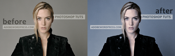 Photoshop ile Fotoğraflarınıza Mavi Tonlama
 CSS ile Sayfa Yığını
 Photoshop ile Serbest Çalışma #2
 Sadece CSS ile Yatay Menü
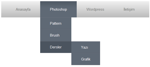 Sadece CSS Kullanarak Dropdown Menu Nasıl Hazırlanır
 CSS ile Ekranın Tam Ortası
 CSS Renk İsimleri
 2021 Logo Trendleri
 CSS ile Spiral ve Çizgisel Arkaplan
 CSS3’ün -webkit-animation Elementiyle Daktilo Yazısı
 CodePen’de Yapılmış En Etkileyici 10 Çalışma
 WordPress Kullanıcılarına .htaccess İpuçları
 Photoshop ile CD Kaplama & Giydirme (Bob Marley Cover)
 Photoshop ile Yazılardan Portre Oluşturmak